Today, we are showcasing a bright, beautiful, warm, complementary colour palette that features our colour of the month, Colour #76.
I mentioned previously that my stitch group visited me last summer, and they assisted me in choosing various palettes. While I always enjoy selecting colour palettes myself, I frequently find that input from others is invaluable. It’s nice to have a fresh perspective on what combinations work best!
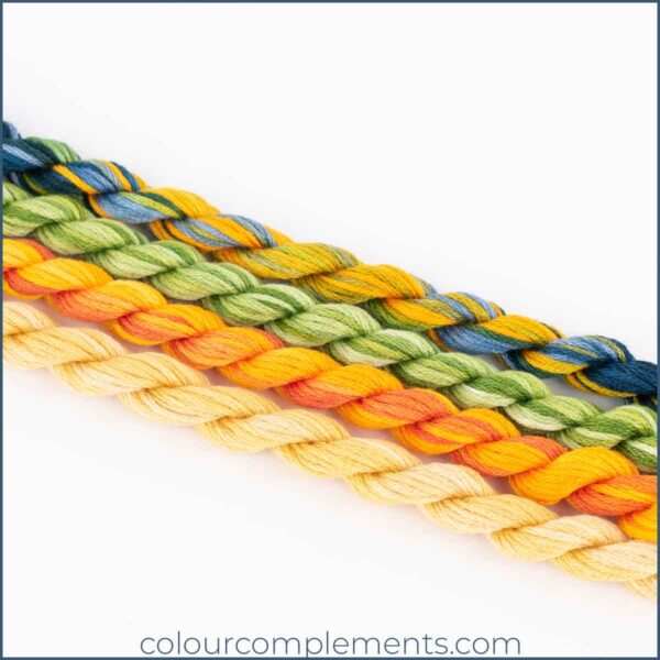
How this complementary colour palette was created
The palette above features four Colour Complements colours:
Colour #37 is a blend of golden yellows and orange; Colour #55 is a blend of greens, and Colour #61 is a pale and subtle blend of yellow/tan. Colour #76, our feature colour, is a blend of yellow/green, golden yellow and dark and medium blue.
If I were selecting some solid Perle cotton why not try these choices
- Yellows – DMC 742, 972
- Blues – DMC 809, 826
- Greens – DMC 470 or 907

The group chose a second palette once again featuring Colour #76 but this time combining it with colour 77, a blend of golden brown and orange and Colour #162, a softer blend of blues and greens. A great way to break up all the warmth that you might get with the first palette:
I’ll be sharing a stitched sample with one of these palettes later this week so stay tuned.


