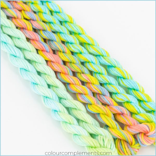
We’ve been talking about Colour #23 this month. I hope we’ve successfully demonstrated how this colour combination can create a harmonious thread palette.
You no doubt know by now that I love creating colourful palettes. Colour 23 is a lovely blend and versatile combination of yellow, blue and coral pink with hints of green.
Several of my stitch group visited my home studio for a stitching day! They wanted to stitch in my studio/office space to be “surrounded by colour.” It is always fun. We started talking about colour (of course) and threads, and one thing led to another, and we started selecting colour palettes for this series of blog posts.
We’ve combined Colour #23 with various other colours this month, but these three colours were particularly appealing to the group. We all felt they would create a very harmonious thread palette.
Creating A Harmonious Thread Palette
I’ve discussed before the importance of value when creating a palette. Two of the three colours in this palette are medium-value blends, while the third is a much softer blend. If you recall, value refers to the lightness or darkness of a colour. We used three colours for this palette.
Last month I talked about the mood of your palette will be determined by the value of the colours you choose. I think our mood is more subtle, don’t you? Perhaps think about bolder shades of turquoise and corals of greens to give a more vibrant palette. As always, play with colour!


