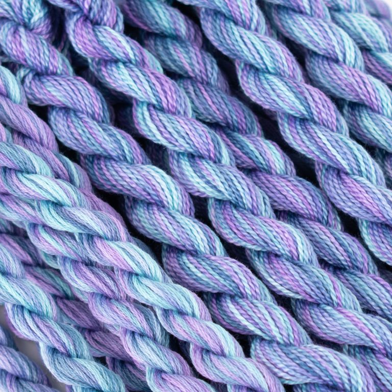
Let’s talk about red violet and purple today! AND, a little about a complementary and analogous colour palette! I love purple and gravitate towards it frequently when creating a needlework palette. Since I wanted to feature these two colours as my dominant colours in the palette, I chose Colour #69 and Colour #44 which includes red violet and fuchsia.
Red violet and purple can look equally beautiful, simply varying values and textures of these two colours creating a harmonious colour combination.
Combining red violet and purple present a variety of possibilities for a needlework palette. From vibrant floral patterns to abstract designs and intricate tapestries, this colour pairing brings a touch of drama, elegance, and visual intrigue to your projects.
Explore your needlework project’s diverse applications, from decorative accents to main focal points. The range of possibilities is endless with this colour palette!
What colours did we choose for our complementary AND analogous colour palette
Instead, we chose a bolder palette featuring a lot of colour!
Since yellow is complementary to purple, we selected Colour #191, a blend of yellows, golden tans and bronze. Colour #3 is a blend of pink, orange and green. We added this to highlight a variation of red, violet and purple because it included pink.
We will showcase a needlepoint sample with this palette so you can see how it works!