I personally love using a contrasting colour palette for my needlepoint projects! If you have followed the website for any time, you will know I like to focus on what else, colour?!
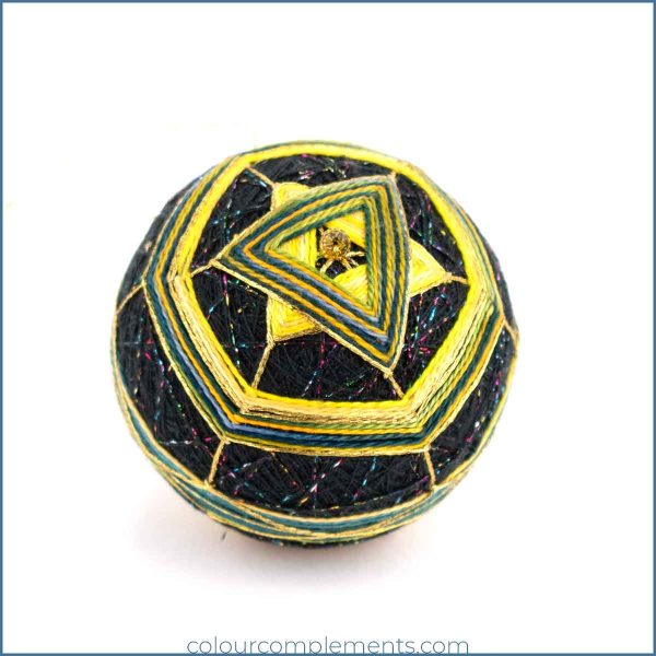
If you want to create a temari ball that pops, consider using contrasting colours like yellow and black in your design.
This bold combination can create a striking visual effect that will catch the eye. The bright and sunny yellow can provide cheerful and uplifting energy, while the black can add a touch of drama and sophistication. Experiment with different stitch patterns and techniques to enhance the contrast and create a genuinely unique temari ball that’s as beautiful as it is eye-catching.
Over this past year, I have featured a variety of palettes, some no doubt more popular than others. While many of you may not be interested in creating Temari balls, I hope these give you colour ideas for any of your needlework projects.
Our Contrasting Colour Palette
Our Temari ball today features an unusual combination of colours, including
Colour #65 is a blend of teal greens combined with Colour #67, a bold blend of yellows. Colour #76 is a blend of blue, green and yellow.
This is Verna’s original design, and it’s evident that she has no fear of experimentation. Let your creativity run wild, and have fun designing either a temari ball or your own needlework design. Why not experiment with a contrasting colour palette for your next project.


