Mastering Straight Stitches: A Beautiful Autumn Sampler Tutorial
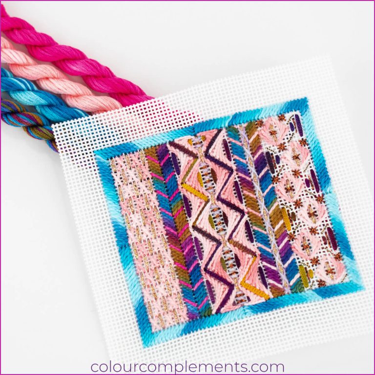
Our featured stitch sampler shows just what you can achieve when you use even basic straight stitches!

Our featured stitch sampler shows just what you can achieve when you use even basic straight stitches!

The transition from summer to autumn brings a beautiful display of nature’s warmest colours, and today, we’re highlighting the stunning and timeless shades of a fall colour palette.

Our ongoing Ginkgo Needlepoint pattern series, where Dominique continues to explore new colour palettes and techniques with each pattern, bringing different interpretations to this existing design. She has been using different canvases and stitch techniques and experimenting with various strands of floss to see how this pattern transforms with each change. Dominique used a contrasting…

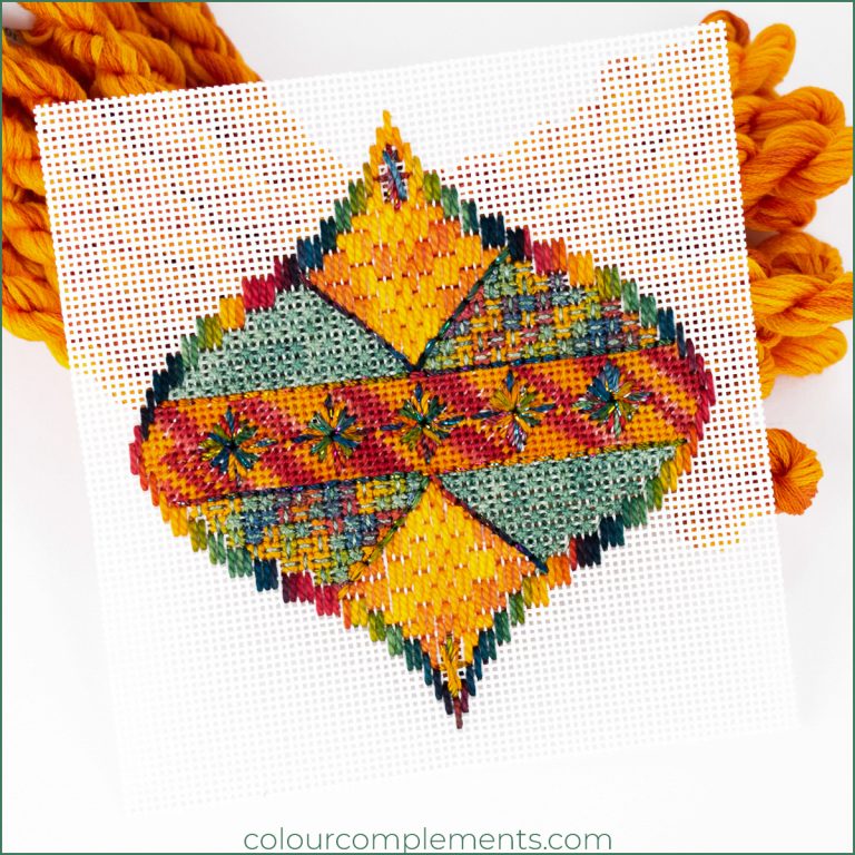
We’re highlighting a beautiful pattern today, “Prelude to Peace,” showcasing how powerful and beautiful tertiary colours can appear when stitched. The pattern was designed by Jim Wurth and is larger, featuring four diamonds. Our sample is one diamond motif incorporating traditional and what some refer to as string stitches. More About Tertiary Colours? Before we…

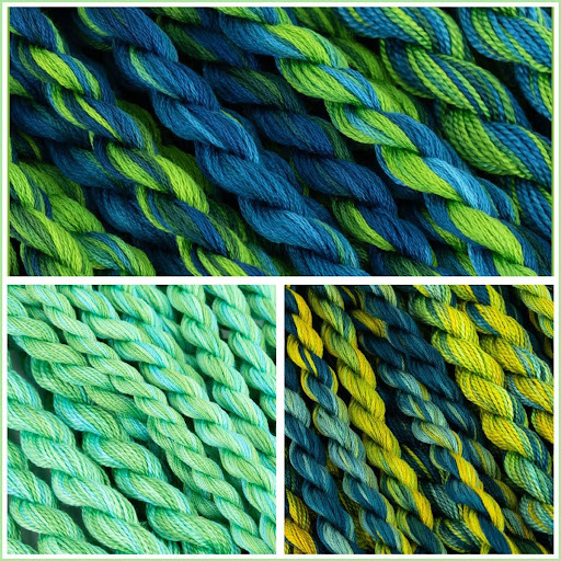
Embroidery is an art form where colour choices can truly transform the look and feel of your work. One combination I personally love is the blue-green palette. In this blog post, I will explore this nature-inspired colour combination using some of the colours in my collection—colours #47, #73, and #162. This palette is perfect for…

Today’s Ginkgo leaf card is stitched on black mono canvas. While many of our samples on the blog use white canvas, which is easier to source, we wanted to highlight the striking contrast of using black. Although stitching on black mono canvas can be a bit challenging, the result is well worth the effort for…

Today, our sample highlights one of four diamonds featured in Jim Wurth’s “Prelude to Peace” pattern. Earlier in the month, we talked about a bold, bright, and tropical palette featuring three colours from our Colour Complements collection. Our sample features all three of these colours. This vibrant palette reminds me of the warmth of summer….

In today’s blog I’m featuring a bold, tropical colour palette that is sure to make any project of yours pop. This palette features aqua, lime, yellow, and hues of orange and red, creating a vibrant colour combination. Whether it’s combining these colours together or using them separately for specific projects, we’re exploring how these colours…

I’m highlighting a stitched design that can be created using a berry-coloured palette. Have I mentioned in previous blog posts, that I LOVE the blend of berry, navy and fuchsia in Colour #83. It has all of the different colours that are reminiscent of the different summertime berries and is combined with a deep navy…

When it comes to the infinite colour combinations you can create, there’s nothing quite like fusing berry, navy and fuchsia to create a truly unique palette. I love combining these colours as it’s a captivating blend of deep, rich tones that create the perfect balance of uniqueness and elegance. This is one of my favourite…
No products in the cart.